This is the first post in a series about visualizing monitoring data. This post focuses on timeseries graphs.
Observability is not just about having monitoring data—that data must be easily available and interpretable. Choosing the right visualization for your data is an important part of providing human-readable representations of the health and performance of your systems. There is no one-size-fits-all solution: you can see different things in the same metric with different graph types.
To help you effectively visualize your metrics, this first post explores four different types of timeseries graphs, which have time on the x-axis and metric values on the y-axis:
For each graph type, we’ll explain how it works, when to use it, and when to use something else.
Line graphs
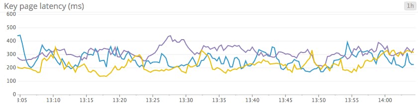
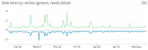
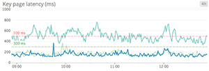
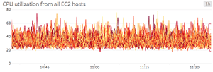
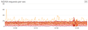
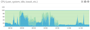
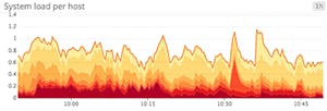
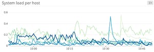
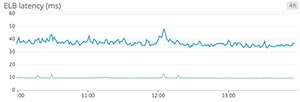
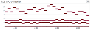
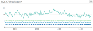
Line graphs are the simplest way to translate metric data into visuals, but often they’re used by default when a different graph would be more appropriate. For instance, a graph of wildly fluctuating metrics from hundreds of hosts quickly becomes harder to disentangle than steel wool. It’s nearly impossible to draw any useful conclusions about your systems from a graph like that.
When to use line graphs
When to use something else

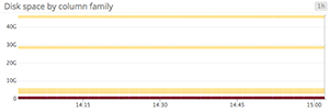
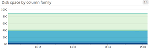
Stacked area graphs
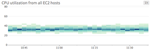
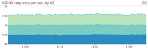
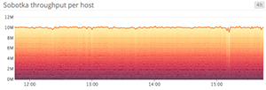
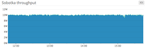
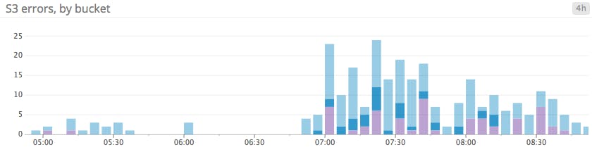
Area graphs are similar to line graphs, except the metric values are represented by two-dimensional bands rather than lines. Multiple timeseries can be summed together simply by stacking the bands, but too many bands makes the graph hard to interpret. If each band is only a pixel or two tall, the information conveyed is minimal.
When to use stacked area graphs

When to use something else

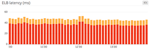
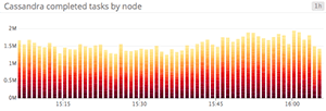
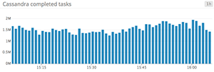
Bar graphs
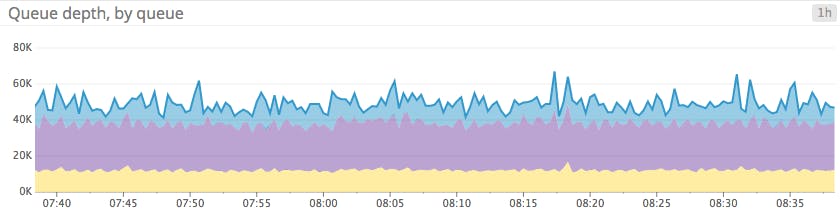
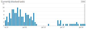
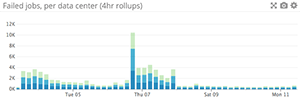
In a bar graph, each bar represents a metric rollup over a time interval. This feature makes bar graphs ideal for representing counts. Unlike gauge metrics, which represent an instantaneous value, count metrics only make sense when paired with a time interval (e.g., 13 server errors in the past five minutes).
Bar graphs require no interpolation to connect one interval to the next, making them especially useful for representing sparse metrics. Like area graphs, they naturally accommodate stacking and summing of metrics.
When to use bar graphs
When to use something else
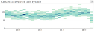
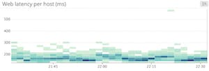
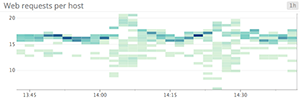
Heat maps
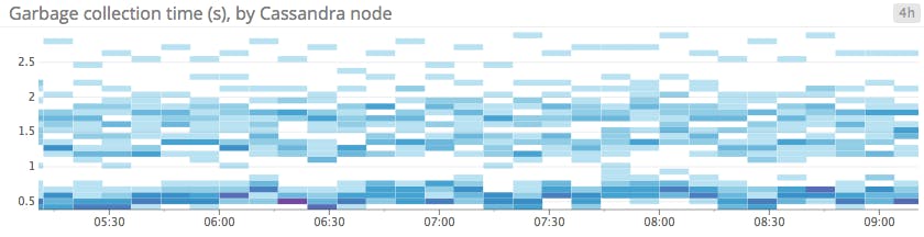
Heat maps show the distribution of values for a metric evolving over time. Specifically, each column represents a distribution of values during a particular time slice. Each cell’s shading corresponds to the number of entities reporting that particular value during that particular time.
Heat maps are essentially distribution graphs, except that heat maps show change over time, and distribution graphs are a snapshot of a particular window of time. Distributions are covered in Part 2 of this series.
When to use heat maps
When to use something else
Conclusion
By understanding the ideal use cases and limitations of each kind of timeseries graph, you can present actionable information from your metrics more clearly, thereby providing observability into your systems.
In the next article in this series, we’ll explore other methods of graphing and monitoring metrics, including change graphs, ranked lists, distributions, and other visualizations.
Comments
Post a Comment
https://gengwg.blogspot.com/